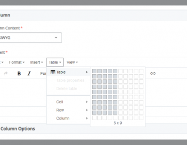
Support for Cascade Content Management System
The Cascade Content Management System (CMS) is the program we use to create and maintain University of Montana websites. Cascade allows site editors to focus on displaying quality content without having to worry about making their site work, brand management, etc... Cascade takes care of all of that for you.
Planning for Change on umt.edu
We are preparing new template designs for implementation on the umt.edu site to align it with the new brand, expand the ways in which our CMS community can develop and sustain their content and ensure that our site meets or exceeds accessibility requirements. We expect to transition to these new templates in mid-May 2024 with launch in June.
Frequently Visited Pages


Open Office Hours
Web Technology Services holds Open Office Hours on a Zoom session every workday from 3 to 5 p.m.


Introduction to Cascade
Our 90-minute introductory training video covers most of what you will need to know in Cascade in order to manage your site.