Navigation
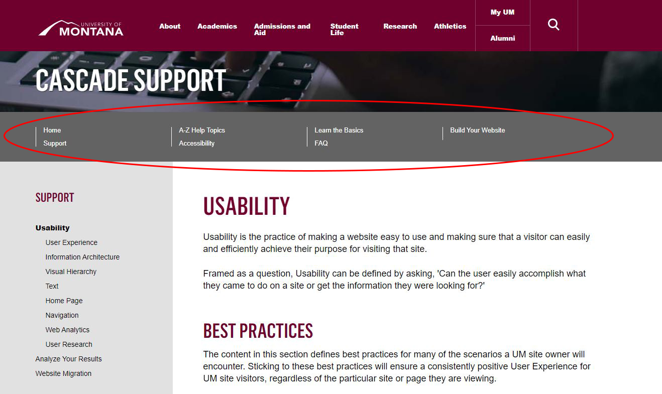
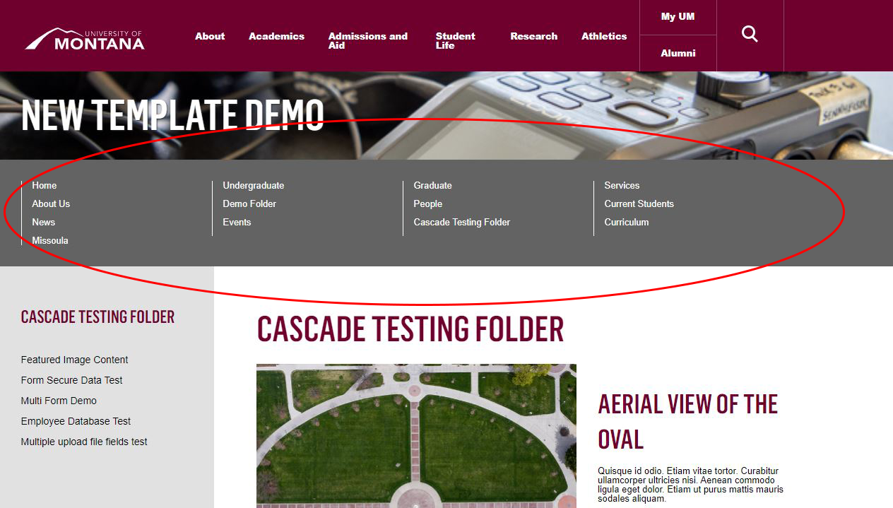
It is a best practice to have eight or fewer top-level navigation items on your site. More than eight items in your top-level navigation can be visually overwhelming to a site visitor, reduce the readability of your site's navigation and prompt a negative reaction to your site.
Good
Eight or fewer top-level navigation items makes for a more positive, less confusing user experience.
Not-So-Good
Nine or more top-level navigation items can feel cluttered and overwhelming to the user.
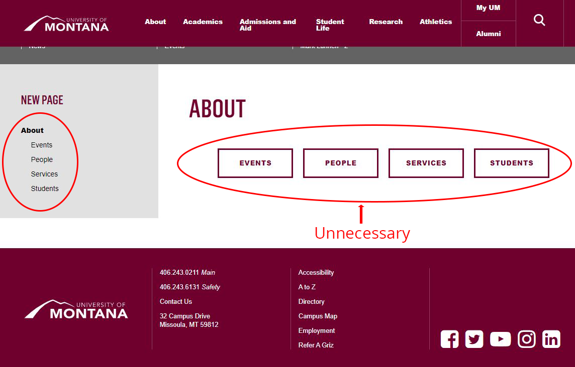
Don't Unnecessarily Recreate Navigation
Don't recreate navigation with assets like buttons or bulleted lists. The top-level and left-hand navigation is designed to guide visitors. They are a standard web convention and visitors don't need extra navigation in the form of buttons or bulleted lists to get where they want to go.
Additionally, buttons should be used solely for calls to action.