The maps in our Disability in America Map Series show rates of disability for every county in the U.S. using American Community Survey 5-year data. The ACS does not directly measure disability. Instead, it uses a set of disability indicator questions to identify individuals who may experience a disability. If a respondent can answer “yes” to any one of six functional limitation questions they are classified as having a disability.
Explore these maps in the drop-down menus below. Click on each map image for a larger, downloadable version. Our national maps include disability rates, disability rates by functional limitation, disability rates among veterans, poverty rates among people with disabilities, and employment indicators.
Accessibility
We strive for full accessibility of our materials. Each map includes a text descriptions and, where possible, links to data files. Please contact us to request alternative formats, or if you have ideas for further development of accessibility features.
Disability Rates
-
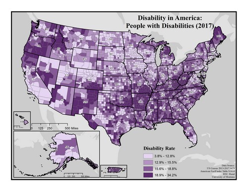
This map of the United States shows general rates of disability by county. Disability rates are broken into four levels: 3.8 to 12.8%, 12.81 to 15.5%, 15.51 to 18.8%, and 18.81 to 34.2%.
Rates tend to be highest (18.81 to 34.2%) in the Southeastern United States (particularly in Appalachia), in northern Maine, northern Michigan, parts of the South and Northwest as well as in Puerto Rico.
Rates tend to be lowest (3.8 to 12.8%) in the Northern Great Plains, parts of the Rocky Mountain West, the Coastal Mid-Atlantic and Southern California.
Map produced January 2019 based on 2013-2017 American Community Survey data.
- Click on the map for a larger, downloadable version.
- To browse or download the data used to make this map, use our Disability Data Lookup Tool.
-
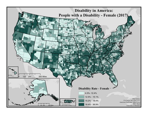
This map of the United States depicts disability rates among females by county. Rates are broken into four categories ranging from 4.3 to 36.9%.
Disability tends to be more common (18.4 to 36.9%) in the Appalachia region, particularly along the Kentucky/West Virginia border, as well as pockets in the South, and Puerto Rico.
Disability among females tends to be less common (4.3 to 12.4%) in Alaska, southern California, and regions of the Rocky Mountains and Great Plains.
Map produced January 2019 based on 2013-2017 American Community Survey data.
- Click on the map for a larger, downloadable version.
- To browse or download the data used to make this map, use our Disability Data Lookup Tool.
- For information on how biological sex is used and defined in the ACS, see “American Community Survey and Puerto Rico Community Survey 2017 Subject Definitions” page 125.
-

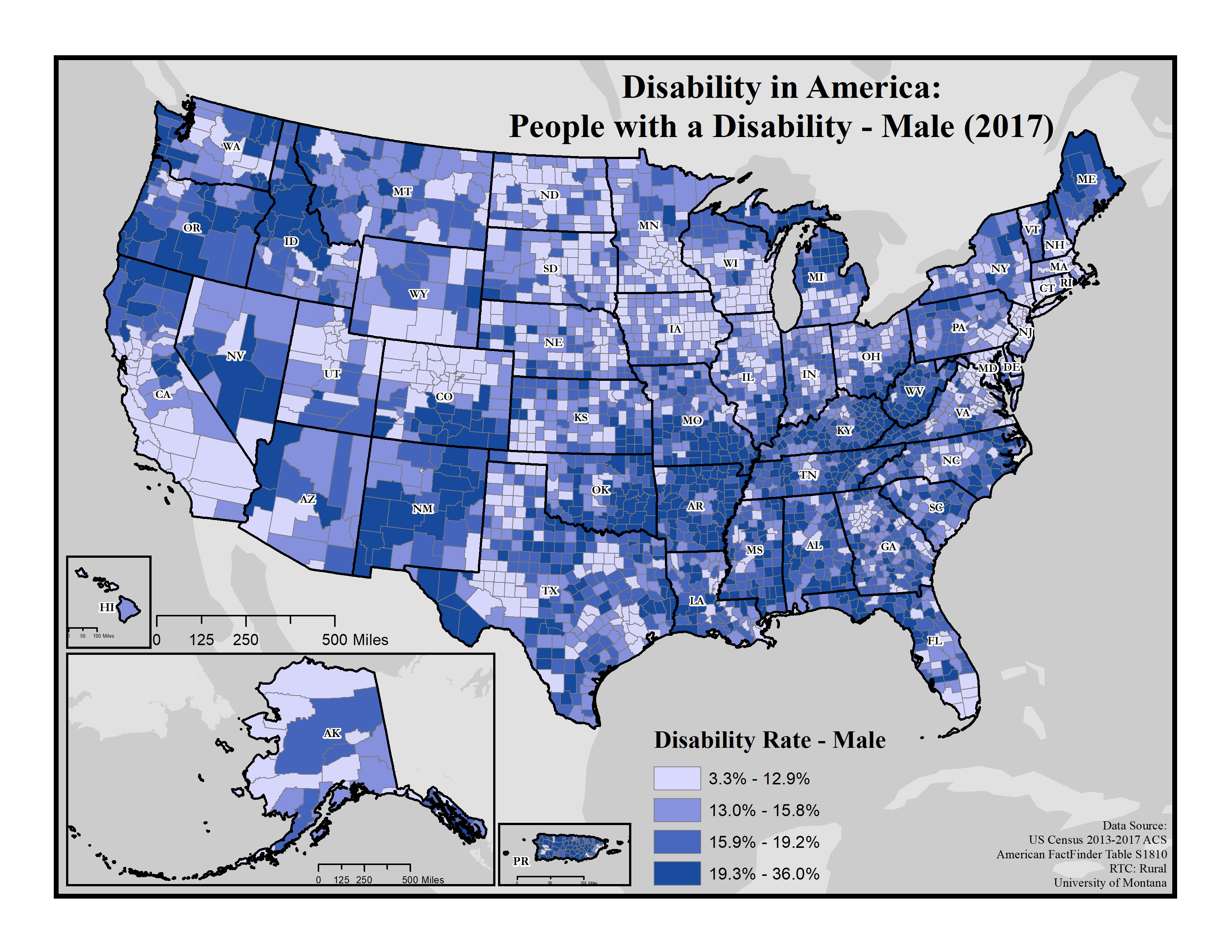
This map of the United States depicts disability rates among males by county. Rates are broken into four categories ranging from 3.3 to 36.0%.
Disability tends to be more common (19.3 to 36.0%) in the Appalachia region and the Southeast, northern Maine and Michigan, parts of New Mexico, southern Nevada, and Puerto Rico.
Disability rates among males are lowest (3.3 to 12.9%) in southern California, regions of the Rocky Mountains and in the Great Plains.
Map produced January 2019 based on 2013-2017 American Community Survey data.
- Click on the map for a larger, downloadable version.
- To browse or download the data used to make this map, use our Disability Data Lookup Tool.
- For information on how biological sex is used and defined in the ACS, see “American Community Survey and Puerto Rico Community Survey 2017 Subject Definitions” page 125.
-
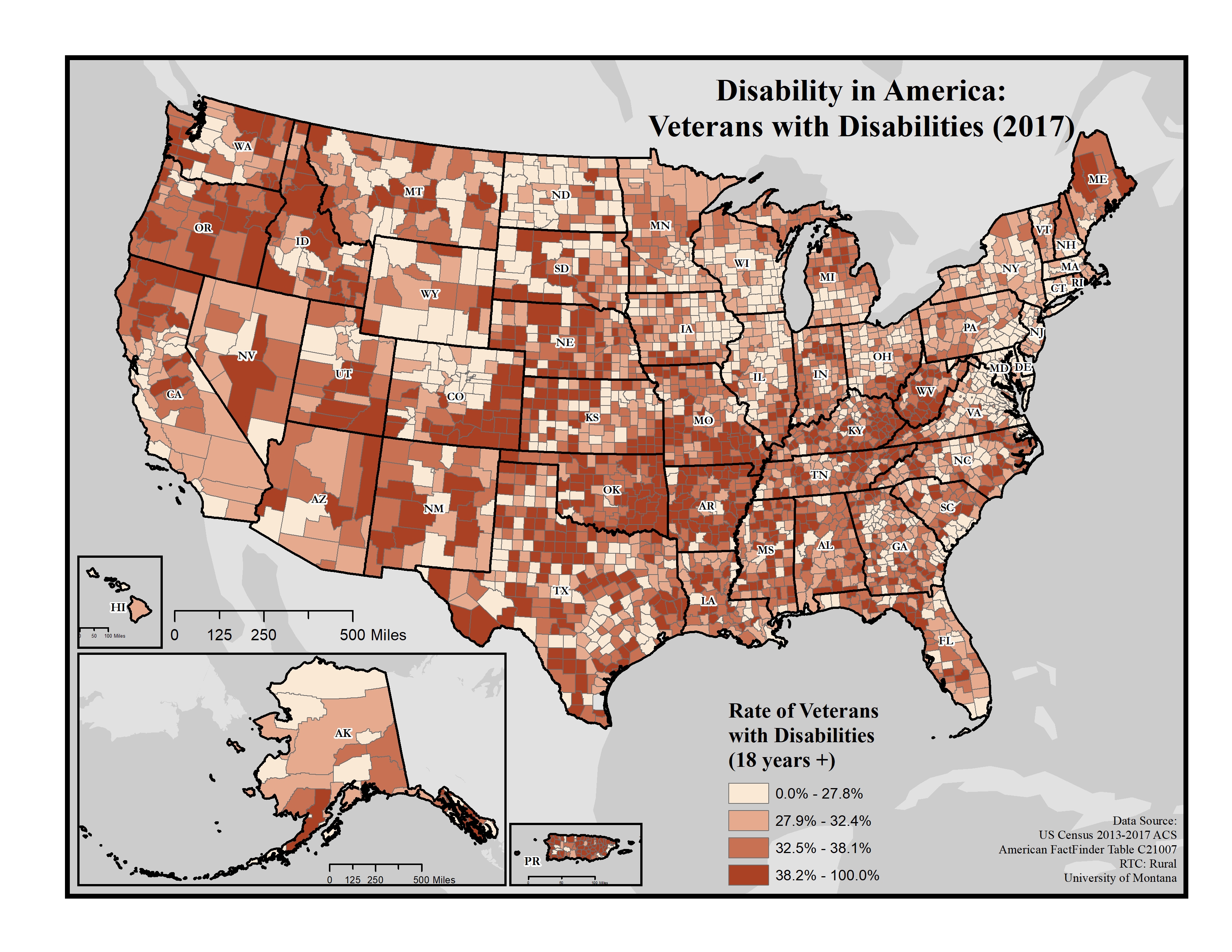
 This map of the United States shows disability rates among veterans by county. Rates are broken into four categories: 0.0 to 27.8%, 27.9 to 32.4%, 32.5 to 38.1%, and 38.2 to 100.0%.
Disability rates tend to be more higher (38.2 to 100.0%) among veterans along the borders of Kentucky, West Virginia, and Virginia. There are also some concentrated pockets of higher rates in New Mexico, Arkansas, Oklahoma, Missouri, Oregon, Maine and Puerto Rico.
Rates tend to be lower (0.0 to 27.8%) among veterans across New England and the Middle Atlantic coast, as well as parts of the Northern Great Plains and Rocky Mountain West.
Map produced January 2019 and updated October 2019 based on 2013-2017 American Community Survey data.
- Click on the map for a larger, downloadable version.
- To browse or download the data used to make this map, use our Disability Data Lookup Tool.
-
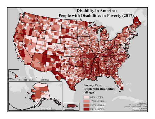 This map of the United States depicts poverty rates among people with disabilities by county. The data includes people of all ages. Rates are broken into four categories ranging from 0.0 to 67.9%.
Poverty is more common (26.1 to 67.9%) among people with disabilities in the South, especially in eastern Kentucky and areas of Missouri, Mississippi and Alabama, as well as northern Maine.
Poverty is generally lower (0.0 to 21.6%) among people with disabilities in the Great Plains and Midwestern states throughout the Rocky Mountain region and across Coastal New England and the Middle Atlantic.
Map produced January 2019 based on 2013-2017 American Community Survey data.
- Click on the map for a larger, downloadable version.
- To browse or download the data used to make this map, use our Disability Data Lookup Tool.


Disability and Employment Rates
-
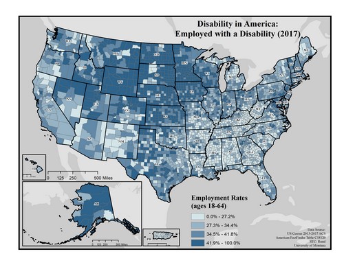
This map of the United States shows employment rates among people with disabilities by county. The data includes people ages 18 to 64. Rates are broken into four categories ranging from 0.0 to 100.0%.
Employment rates appear to be higher (41.9 to 100.0%) in Alaska, the Great Plains and Rocky Mountain areas, and in western Utah and northern Nevada.
Employment rates are significantly lower (0.0 to 27.2%) in the South, Appalachia, northern Michigan, the Southwest and Puerto Rico.
Map produced January 2019 based on 2013-2017 American Community Survey data.
- Click on the map for a larger, downloadable version.
- To browse or download the data used to make this map, use our Disability Data Lookup Tool.
-
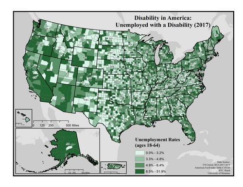
This map of the United States shows unemployment rates among people with disabilities by county. Rates are broken into four categories ranging from 0.0 to 51.9%.
Unemployment rates are higher (6.5 to 51.9%) throughout much of Alaska, Oregon and California as well as across New England and the Midwest. Lower rates are found in the Great Plains but in general rates are varied throughout the country.
Note: It is important to consider unemployment rates in addition to out of the labor force rates. This map only shows people with disabilities who are in the labor force. See Disability in America: Out of the Labor Force with a Disability (2017) for rates of people out of the labor force.
Map produced January 2019 based on 2013-2017 American Community Survey data.
- Click on the map for a larger, downloadable version.
- To browse or download the data used to make this map, use our Disability Data Lookup Tool.
-
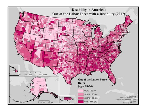
This map of the United States shows rates of people with disabilities who are out of labor force by county. The data includes people ages 18 to 64. Rates are broken down into four categories ranging from 0.0 to 100.0%.
Rates of people with disabilities no longer in the labor force are extremely high (68.0 to 100%) throughout large sections of the South, especially in Kentucky, West Virginia, Mississippi, and Alabama.
Rates are lower (0.0 to 52.8%) throughout the Great Plains and Rocky Mountain regions including Wyoming, North Dakota, South Dakota and Minnesota.
Map produced January 2019 based on 2013-2017 American Community Survey data.
- Click on the map for a larger, downloadable version.
- To browse or download the data used to make this map, use our Disability Data Lookup Tool.


Disability Rates by Functional Limitation
-
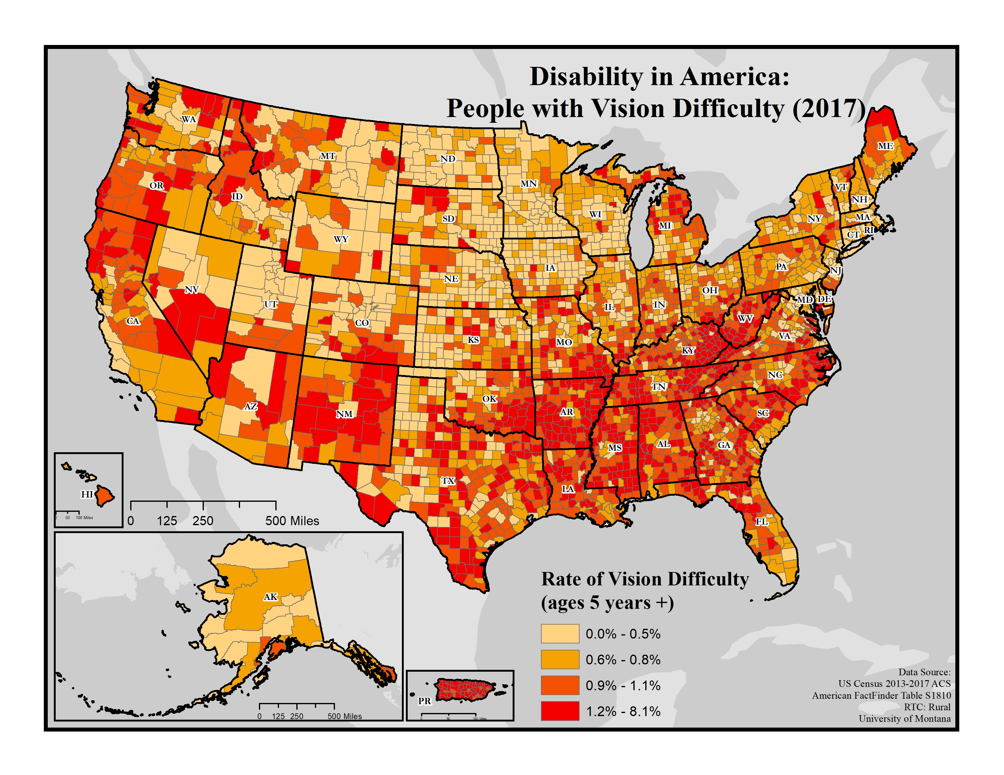
This map explores the American Community Survey (ACS) 5-year data (Table S1810) on disability estimates by county.
For vision difficulty, the ACS asks if a respondent is blind or has serious difficulty seeing, even when wearing glasses. If they answer “yes” they are classified as having a vision difficulty. This data is for all ages.
 This map of the United States shows rates of vision difficulty by county. Only people aged 5 years and older are included in these data. Rates are broken into four categories ranging from 0.0 to 8.1%.
Rates of vision difficulty appear to be higher (1.2 to 8.1%) in Appalachian (particularly along the Kentucky/West Virginia border) and Southern states, parts of New Mexico, the northern Rocky Mountains, Northern California, and Southern Oregon.
Rates seem to be lower (0.0 to 0.5%) in the Great Plains, Midwest, and the Northeast.
Map produced January 2019 based on 2013-2017 American Community Survey data.
- Click on the map for a larger, downloadable version.
- To browse or download the data used to make this map, use our Disability Data Lookup Tool.
-
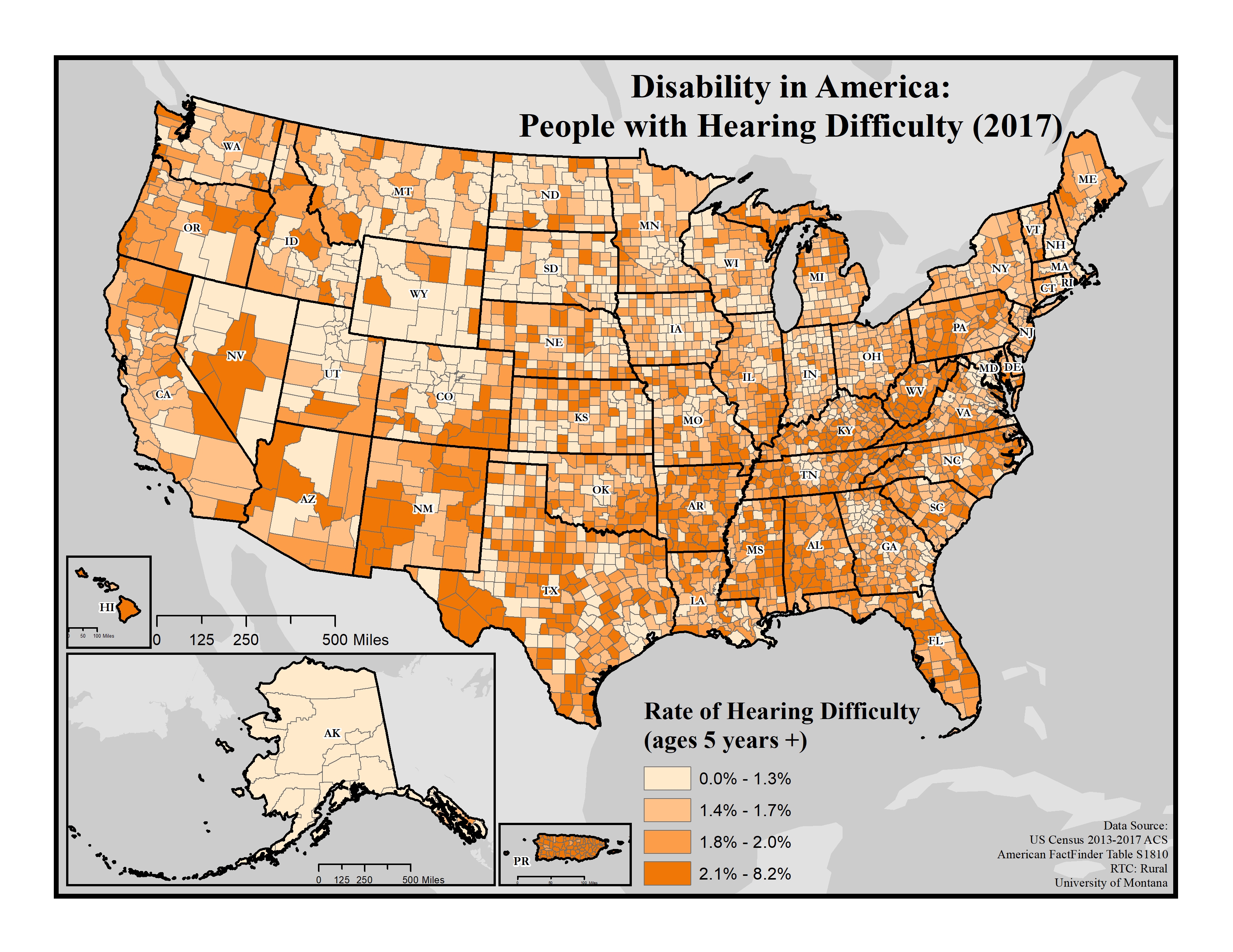
This map explores the American Community Survey (ACS) 5-year data (Table S1810) on disability estimates by county.
For hearing difficulty, the ACS asks if a respondent is deaf or has serious difficulty hearing. If they answer “yes” they are classified as having a hearing difficulty. This data is for all ages.
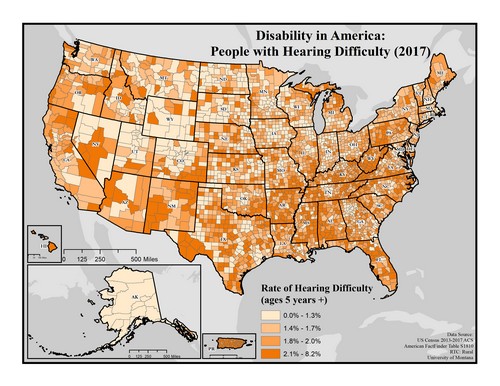 This map of the United States shows rates of hearing difficulty by county. Rates are broken down into four categories ranging from 0.0 to 8.2%.
Rates of hearing difficulty appear to be higher (2.1 to 8.2%) in southern Nevada, parts of New Mexico and southern Colorado, Appalachia and parts of the south (Arkansas, Mississippi, and Alabama), and northern Michigan.
Rates seem to be lower (0.0 to 1.3%) across Alaska, the Great Lakes, most of Wyoming, and parts of the Rocky Mountains and Utah.
Map produced January 2019 based on 2013-2017 American Community Survey data.
- Click on the map for a larger, downloadable version.
- To browse or download the data used to make this map, use our Disability Data Lookup Tool.
-
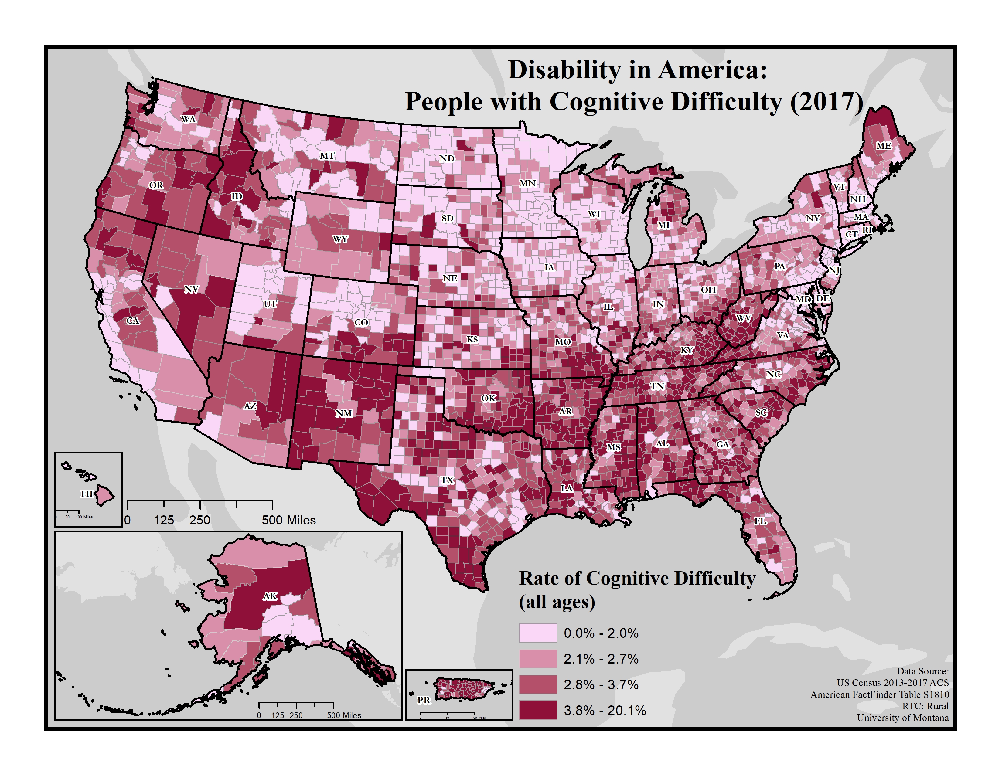
These maps explore the American Community Survey (ACS) 5-year data (Table S1810) on disability estimates by county.
For cognitive difficulty, the ACS asks because of a physical, mental, or emotional problem, does the respondent have difficulty remembering, concentrating, or making decisions. If they answer “yes” they are classified as having a cognitive difficulty. This data is for ages 5 and up.
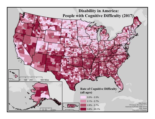
This map of the United States shows rates of cognitive difficulty by county. Rates are broken down into four categories ranging from 0 to 20.1%.
Rates of cognitive difficulty appear to be higher (3.8 to 20.1%) in northern Maine, Appalachia, parts of northern California and southern Oregon, and parts of the Southwest.
Rates seem to be lower (0.0 to 8.3%) in the Great Plains and parts of the Rocky Mountains.
Map produced January 2019 based on 2013-2017 American Community Survey data.
- Click on the map for a larger, downloadable version.
- To browse or download the data used to make this map, use our Disability Data Lookup Tool.
-
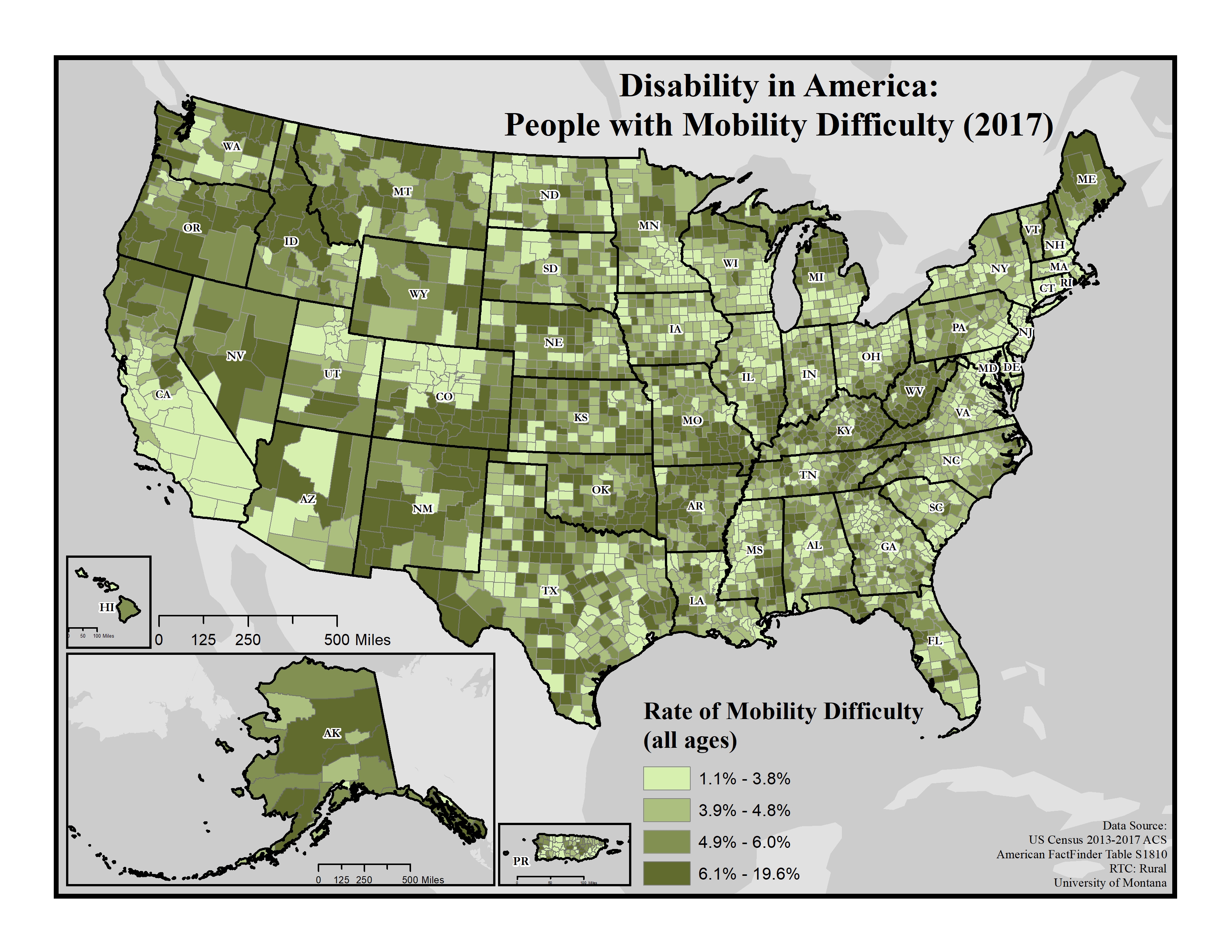
These maps explore the American Community Survey (ACS) 5-year data (Table S1810) on disability estimates by county.
For ambulatory (i.e. mobility) difficulty, the ACS asks if a respondent has serious difficulty walking or climbing stairs. If they answer “yes” they are classified as having a mobility difficulty. This data is for ages 5 and up.
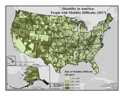
This map of the United States shows rates of mobility difficulty by county. Rates are broken into four categories ranging from 1.1 to 19.6%.
Rates are highest (6.1 to 19.6%) in Appalachia, the South, New Mexico, northern California, Oregon, northern Idaho, southern Colorado, northern Michigan and northern Maine.
Rates are lowest (1.1 to 3.8%) in southern California, the Midwest, and the Northeast.
Map produced January 2019 based on 2013-2017 American Community Survey data.
- Click on the map for a larger, downloadable version.
- To browse or download the data used to make this map, use our Disability Data Lookup Tool.
-
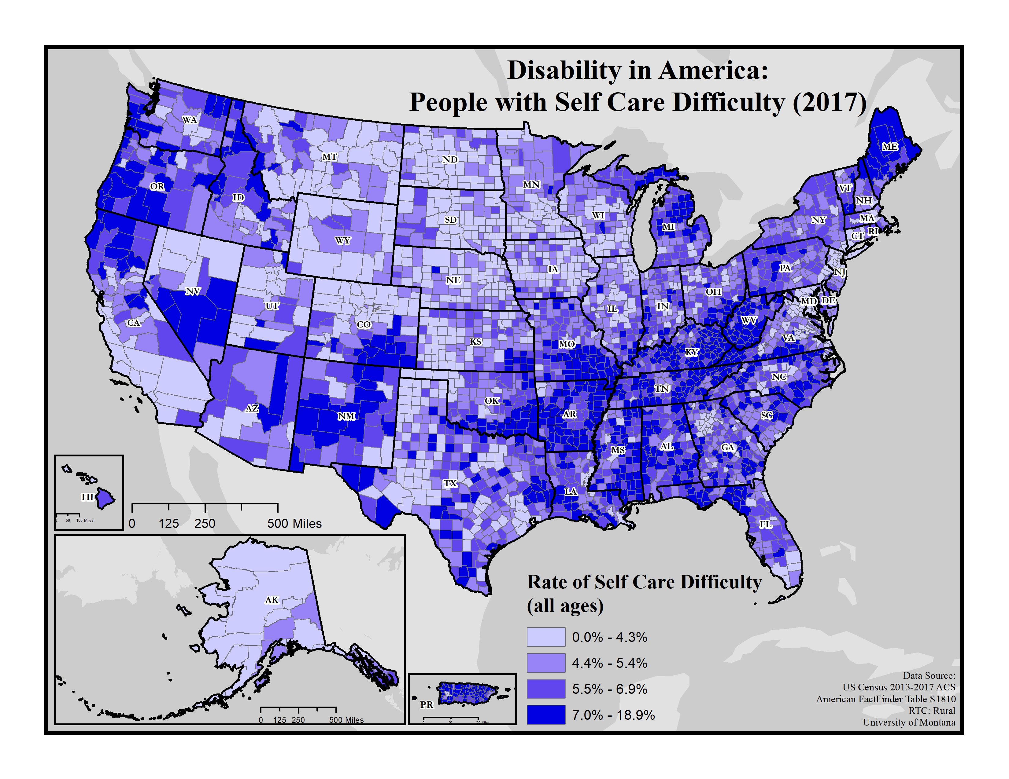
This map explores the American Community Survey (ACS) 5-year data (Table S1810) on disability estimates by county.
For self-care difficulty, the ACS asks if a respondent has difficulty bathing or dressing. If they answer “yes” they are classified as having a self-care difficulty. This data is for ages 5 and up.
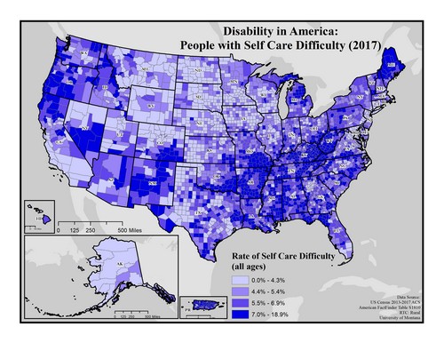 This map of the United States shows rates of self-care difficulty by county. Rates are broken into four categories ranging from 0.0 to 18.9%.
Rates of self-care difficulty are highest (7.0 to 18.9%) in northern Maine and northern Michigan, Appalachia and some areas of the South, parts of New Mexico, southern Nevada, northern California, southern Oregon, and throughout Puerto Rico.
Rates are lowest (0.0 to 4.3%) in Alaska, southern California, northern Nevada, the Rocky Mountains, Great Plains, and the Midwest.
Map produced January 2019 based on 2013-2017 American Community Survey data.
- Click on the map for a larger, downloadable version.
- To browse or download the data used to make this map, use our Disability Data Lookup Tool.
-
This map explores the American Community Survey (ACS) 5-year data (Table S1810) on disability estimates by county.
For independent living difficulty, the ACS asks because of a physical, mental, or emotional problem, does the respondent have difficulty doing errands alone such as visiting a doctor’s office or shopping. If they answer “yes” they are classified as having an independent living difficulty. This data is for ages 18 and up.
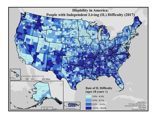 This map of the United States shows rates of independent living difficulty by county. Rates are broken into four categories ranging from 0.8 to 25.8%.
Rates of independent living difficulty appear to be highest (10.5 to 25.8%) in the Appalachia region (particularly along the Kentucky/West Virginia border) and throughout the South, northern Michigan, northern Maine, New Mexico, northern California, and parts of Oregon.
Rates appear to be lowest (0.8 to 6.4%) in Alaska, the Rocky Mountain and Great Plains regions, northern Nevada, and Utah.
Map produced January 2019 based on 2013-2017 American Community Survey data.
- Click on the map for a larger, downloadable version.
- To browse or download the data used to make this map, use our Disability Data Lookup Tool.

Select the map images to access larger, downloadable versions.
To browse or download the data used to make these maps, use our Disability Data Lookup Tool.